

Color theory plays a crucial role in presentation design, influencing how your audience perceives and responds to your content. Understanding color theory helps you create visually appealing and effective presentations that enhance your message.
Let’s explore the fundamentals of color theory and how to apply them to your presentation design.
Understanding Color Basics
Color theory studies how colors interact and the visual effects of color combinations. The basic elements include:
- Hue: The pure color, such as red, blue, or yellow.
- Saturation: The intensity or purity of the color.
- Value: The lightness or darkness of the color.
Understanding these elements helps you create harmonious color schemes and enhance visual impact.
The Color Wheel
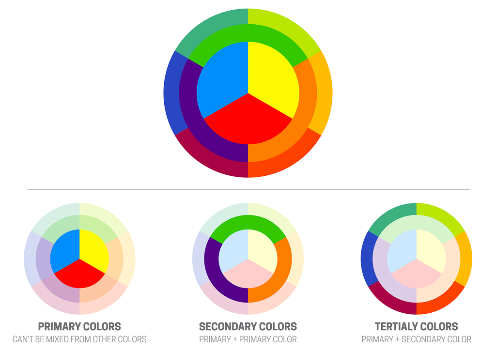
The color wheel illustrates the relationships between colors. It consists of:
- Primary Colors: Red, blue, and yellow.
- Secondary Colors: Green, orange, and purple, created by mixing primary colors.
- Tertiary Colors: Colors formed by mixing primary and secondary colors.
The color wheel helps you understand relationships and create balanced, harmonious schemes.
Color Harmony
Color harmony means creating combinations that feel visually balanced. Common harmonies include:
- Complementary Colors: Opposites on the wheel, such as blue and orange. High contrast and vibrancy.
- Analogous Colors: Next to each other on the wheel, such as blue, blue-green, and green. Cohesive and harmonious.
- Triadic Colors: Three evenly spaced colors, such as red, yellow, and blue. Balanced and vibrant.
- Monochromatic Colors: Variations of a single color. Cohesive and elegant.
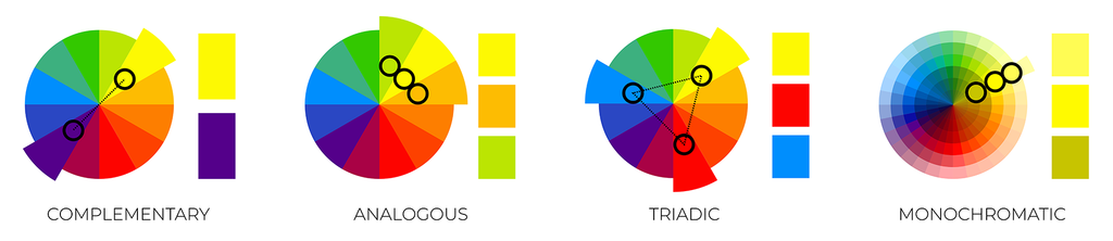
Using harmony enhances visual appeal and ensures your colors work together. As Johannes Itten demonstrated in his foundational work on color relationships, harmony is not accidental; it is the result of intentional structure.
Color Psychology
Color psychology examines how colors influence emotions and behavior. As I discussed in my earlier article, The Science of Persuasion: Designing Presentations That Drive Action, small visual signals influence how audiences interpret information, and color is often one of the first cues they register. Different colors evoke different responses:
- Red: Excitement, urgency, passion.
- Blue: Trust, professionalism, calmness.
- Green: Growth, health, tranquility.
- Yellow: Happiness, energy, attention.
- Purple: Luxury, creativity, sophistication.
- Orange: Enthusiasm, warmth, caution.
- Black: Elegance, power, formality.
- White: Purity, simplicity, cleanliness.
Choose colors that align with the mood and message you want to convey. Color psychologist Angela Wright has long argued that color choices influence perception at a subconscious level, which is why random selection rarely produces strong results.
Creating a Consistent Color Palette
A consistent color palette creates cohesion and professionalism. Choose a primary color aligned with your brand or message, then select complementary secondary and accent colors.
Use your palette consistently throughout your presentation to reinforce identity and visual harmony.
Ensuring Readability Through Contrast
Contrast is essential for readability. Ensure strong contrast between text and background colors. Dark text on a light background or light text on a dark background typically provides the best readability.
Avoid low-contrast combinations that make text difficult to read.
Using Color to Highlight Key Points
Color is a powerful tool for emphasis and visual hierarchy. In my earlier article, Best Practices for Creating Effective Data Visualizations, I explained how color can guide interpretation and highlight meaning when it is applied with intention.
Use bold, contrasting colors to highlight important information.
For example, use a bright accent color for headings or key data points to guide attention.
Avoiding Color Overload
Too many colors create clutter and distraction. Stick to a limited palette to maintain clarity and cohesion. Restraint is often what gives a slide its strength, and color should be used with the same discipline so use it strategically to create interest without overwhelming your audience.
Considering Cultural Associations
Colors carry different meanings across cultures. Be mindful of your audience’s background and how certain colors may be perceived.
For example, white symbolizes purity in many Western cultures but may represent mourning in some Eastern cultures.
Testing and Refining
Before finalizing your presentation, test your color choices on different devices and screens. Seek feedback to identify readability or harmony issues.
Refine as needed to ensure clarity and impact.
Bottom Line
By understanding and applying color theory, you can create presentations that are visually appealing, cohesive, and effective. Use the color wheel and harmony principles, consider psychology and culture, ensure readability, and apply color with intention.
Color is never just decoration; it is one of the fastest signals your audience reads before they process a single word.
Start applying these principles to strengthen the visual impact of your presentations.